This picture is made by desaturating it then using the burn tool. I used the burn tool on me (the person). I like this picture because, once again the photography is spectacular. This picture is cool because of the tree and the sun shining through. I really liked the original picture and I wanted to make it a little better and I think it looks really cool
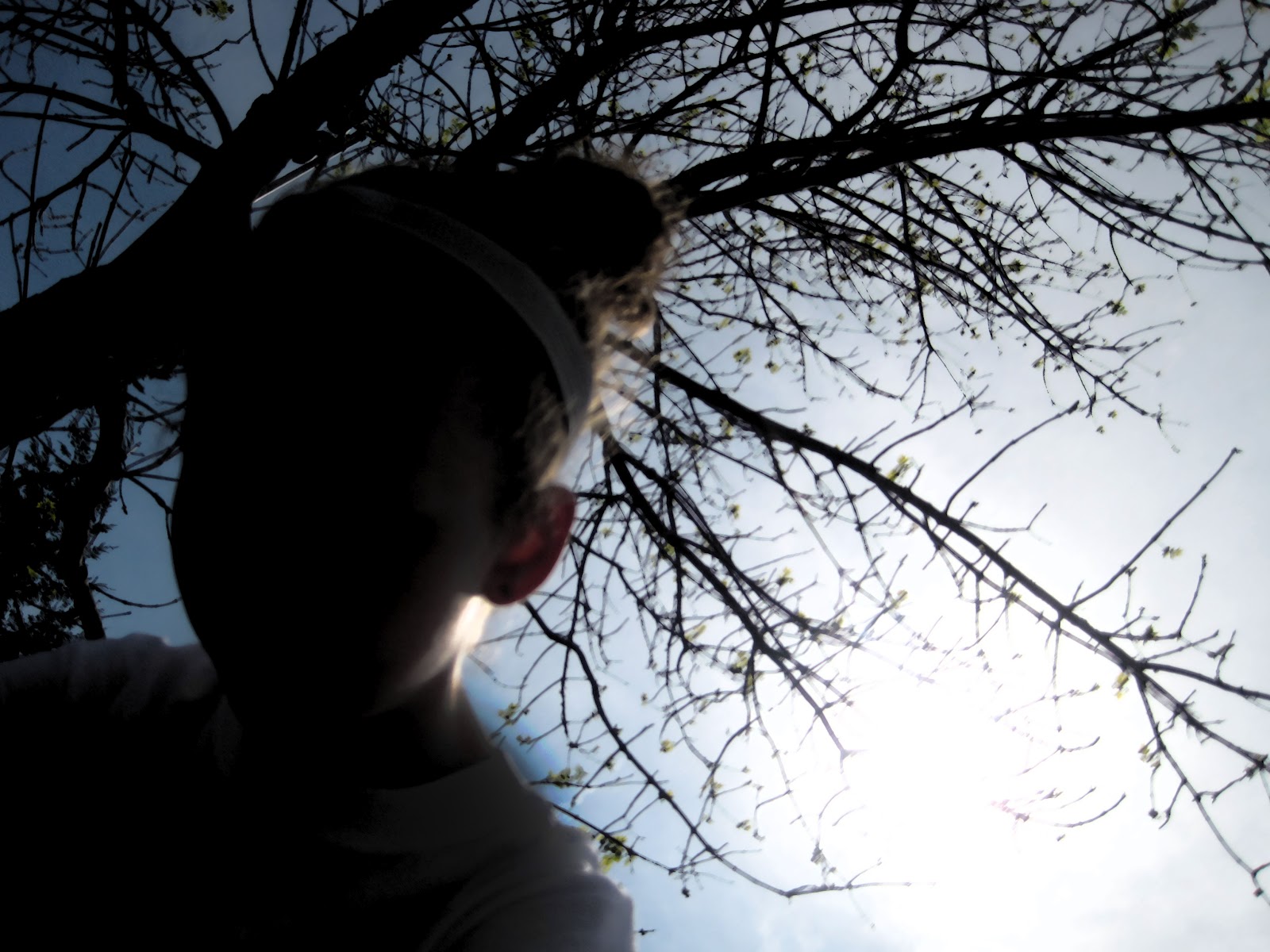
For this project i used a picture of me. I put a filter on it and used the burn tool to make the shadow darker. I liked this picture because it shows my bun (that I wear basically everyday), but it also shows the sun and the tree. I think Katie took this picture, and its really good.
For this project I took a picture of Katie and did a filter and color replacement. This picture looked cool and I liked how the sun gave her shadows and how the light hit her. I chose a filter that emphasized this idea. I also did the color replacement because I wanted to make her stand out and still have a cool background. I thought this turned out really well!
For this project, we had to make a project that Incorporated 5 pictures that we created during the year. I chose my HOPE project, one of the 6 projects, wordle, a tutorial, and a visual pun. We also had to incorporate a boarder which i put on my "information" (its fake). I changed the colors of the push-pins and had the idea that they were on a cork board.
Similar to the 6 pictures series, this project was based on the movie Hotel Rwanda. A theme in this movie is hope, which is what I did this project on. I took pictures that to me made me feel hope. I choose a picture with a light in the middle of darkness, friends making a peace sign with their hands, a rainbow and a candle or a flame. This theme of hope is portrayed in the movie Hotel Rwanda because they had hope.
For this project we had to create 6 pictures that went together in a common theme. This theme had to be related to the themes found in the movie "Hotel Rwanda". My theme was "black and white" to prove that everyday tings are black and white, and to point out racism based off the uncontrollable color of one's skin. My favorite picture is of the world in black and white, and how in America's eyes they are all white and stand out compared to the rest of the world. The picture with beautiful hands was modeled by Erin Clark.
My Animoto Video
We had to create a video using "animoto". You upload some pictures, put in music and your done! For my video I uploaded pictures of Katie then Erin. I also choose the blossom theme.
For this project we had to create a "hidden picture". There is a hidden elephant in this brick wall picture. If you can't see it, it is in the upper left corner. I got a picture of a brick wall and a picture of an elephant. I cut out the elephant, made it grayer and darker (using the burn tool and color replacement). This was a hard project to come up with an idea. Its also hard to hide the picture, they are normally easily spotted.
For this project we had to take a picture and duplicated then put a tent on them to make them a different color. We had to cut it out of a different back ground. Then we had to put a gradient on the back. I used past-pictures for both of these. I liked the outcome of this project.
We had to get a picture of a chair, then cover it with pictures, leaving some of the original chair visible. Then we had to burn/dodge tool and make the light agree with the background. I used a perspective tutorial on photoshopuser.com to put the pictures onto the chair. The part I don't like about the perspective is that you can only do 4-sided picture shapes.
We had to do another photoshopuser project. This one is called "Color Replacement". It is pretty easy and the finished product is a lot different and it changes it drastically. The first picture is the original one- a red car. Then with color replacement I changed the color to pink and changed the black parts to a subtle purple. I thought it came out well.
Today we had to go to www.photoshopuser.com and do two of the tutorials. The first one uses blur. I think the first one turned out really well because it has a cool effect. The second is a picture of time square that I inserted posters. The original picture of time square was not very good for this tutorial, but I made it work. I inserted the two posters of "The Little Princess" and the quote about slinkies.
For this project, we had to take 1/2 of a picture and turn the other 1/2 inside out. I used a picture of Erin and I put in pictures of what she likes to do, and her interests. I used a picture of a basketball, a pink bow, head phones, Lego's, a picture of Bridget, and her cellphone.
For our midterm we had to do a project using a list of tools. These pictures are of me, Katie, and Erin. The shadow is also of us. I wanted to focus on green and a little bit of blue as a color scheme. I liked how this turned out.
We watched a movie that was about a little girl named Marla. Marla was popular for her modern art. The movie was about people trying to figure out if it was really Marla's work. Our project was to create an abstract piece of art. This might not look like Marla's work, but I like this.
For this project we had to make a holiday card. I choose to do a Valentines Day card. I really like the owls, they are so cute! I saw a t-shirt that said "Owl you need is love" and I thought it would work for this project! <3
For this project we had to take a picture of ourselves, duplicate it, then filters! I don't remember which filters I used. Then for the background I used a colorful background that I found online.
Today, we had to find two pictures that inspire us. The first picture I found online. It is from the Hirshhorn Museum. Its called Shadows by Andy Warhol. This piece inspired me because of the different colors, repetition, and how big it is. The second one is an add in ARTnews. As you can see, it is in the Tai Gallery. The piece is called Natural Prism, Circle. It is by Nakatomi Hajime. This inspired me because I like how it all is connected, but it does not look like it is.